Print/ Digital Ad Campaign
New Balance Concept Ad Campaign

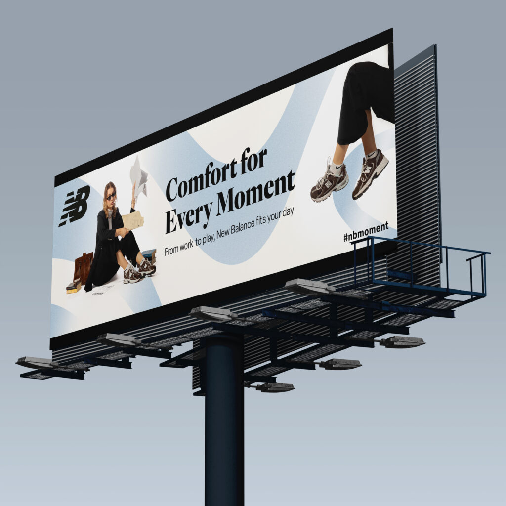

This is a personal project that I completed in collaboration with creative director, Angel Villafranca, and fellow photographer and designer, Valentyn Levko. First, Angel presented us with a project brief for a conceptual advertising campaign for New Balance sneakers. Her idea was to showcase the sneakers in everyday situations, and to highlight their versatility and comfort, while illustrating their timeless, understated style.

The Process
Valentyn and I proceeded to plan the photoshoot, creating a shot list, a call sheet and a prop list. On the day of the photoshoot, both of us took turns photographing our models and assisting each other with setup and lighting. After the photoshoot, we went on to review the images, do basic edits and put together a contact sheet of our best images to send to our creative director, Angel, for her final selections.
From this point on, Valentyn and I worked collaboratively to develop our own advertising campaign, including magazine, billboard and web banner ads. We modified Angel’s original concept in order to keep the main focus on the product by utilizing clean, minimal, yet bold visuals to highlight the simplicity, reliability and everyday use of the sneakers.
I had the idea to take the fluid, line details which many New Balance sneakers feature, and turn them into vectors which could be added to our Advertisements. This created a visual throughline, using a light blue accent colour, to communicate the reliability and understated style of the sneakers.
To complete the campaign, Valentyn designed the billboard advertisement and I designed the magazine and web banner advertisements. For consistency across all ads, Valentyn prepared all the edits on the final photos, while I created all of the blue vector shapes in Illustrator. We collaborated equally in conceptualization, final photo edits, designs and all other tasks.
Brand Re-Design
Birds and Beans Roasters
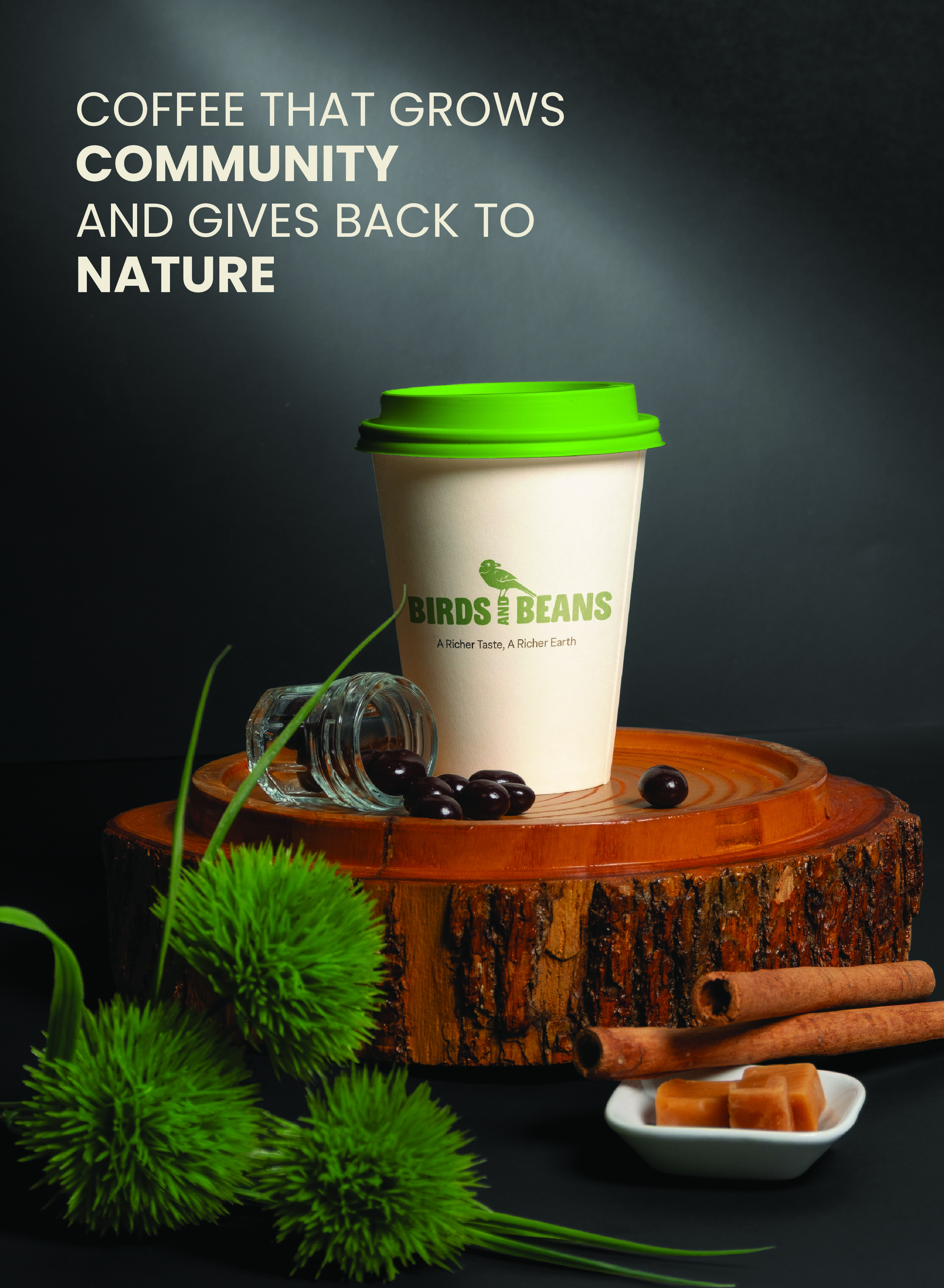

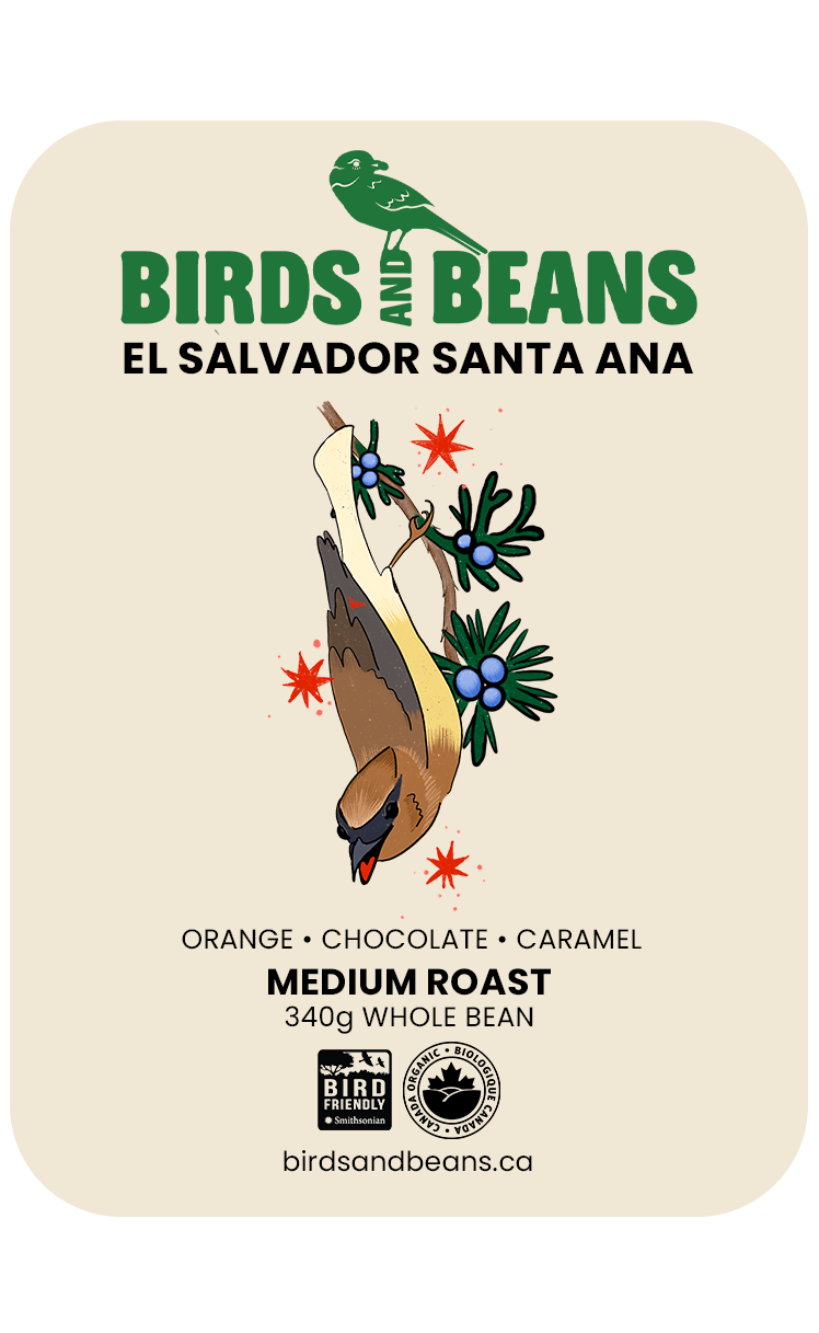
The purpose of this personal project was to develop a new brand identity for Birds and Beans Coffee Roasters, a local small business run out of Etobicoke. My goal was to make the brand more appealing to a younger audience who, according to market research, has become increasingly interested in sustainable consumerism. In Illustrator, I created multiple logo variations, intentionally using different colours to signify light, medium and dark roasts. Then, I illustrated the design for the coffee bean packaging on Procreate, adding the text, logo and icons in Illustrator. The next step was to conduct a studio photoshoot to capture the images you see above. I edited and turned the images into mockups to showcase my designs using Photoshop. Finally, using my logo design, I prepared the file for printing and cutting stickers, using the Roland BN-20A. The stickers provided additional promotional material for the brand.
TRI-FOLD BROCHURE
Riverwood Conservatory

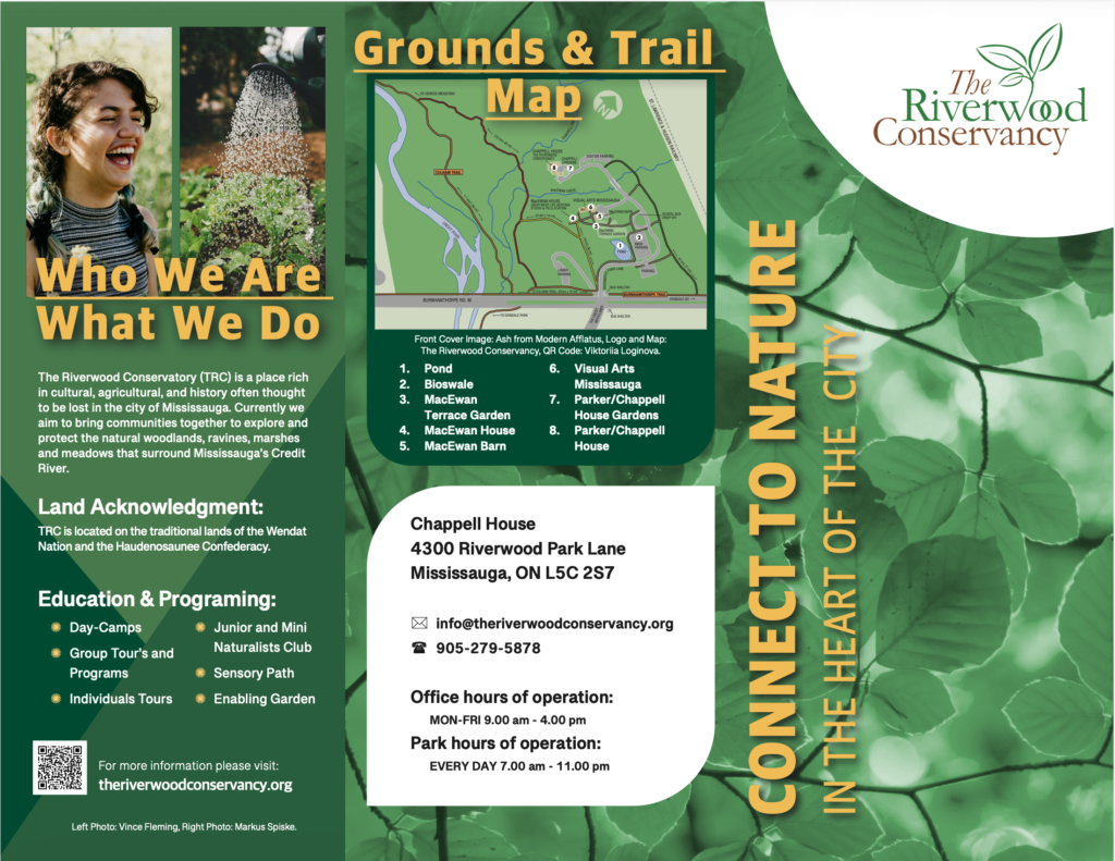
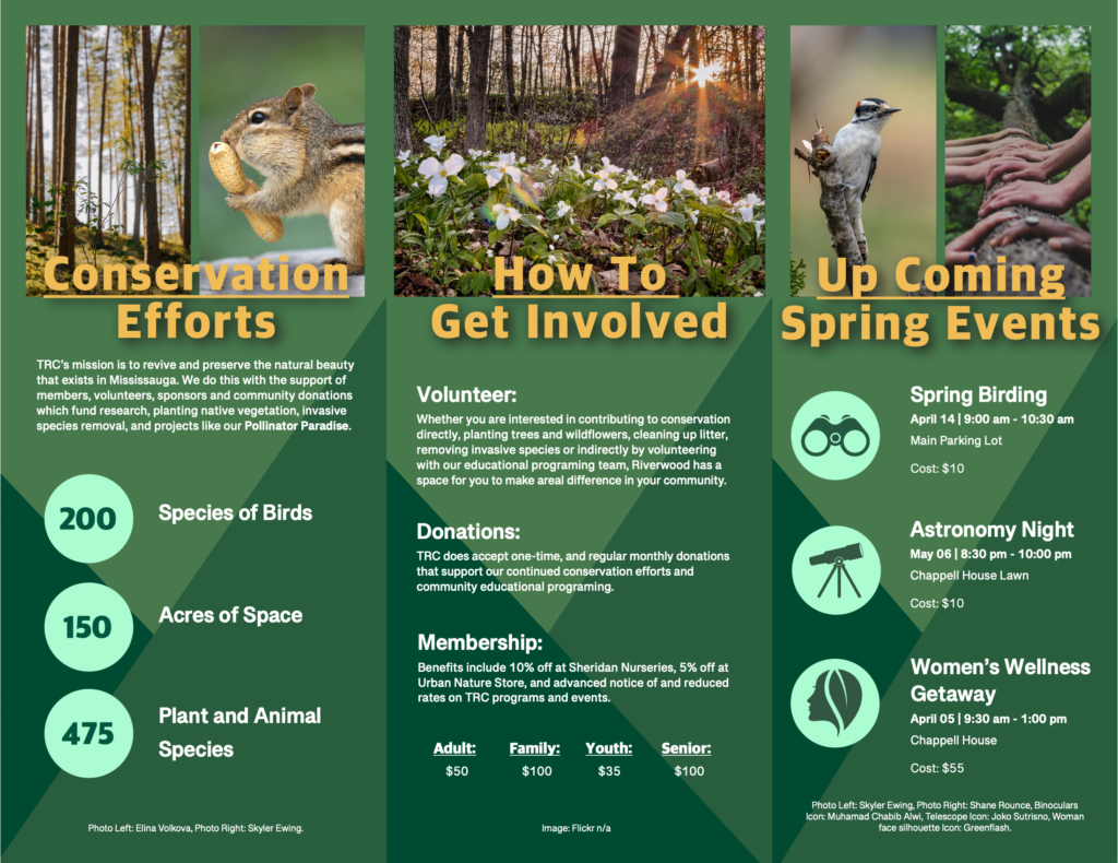
This brochure was a personal project that I researched, designed and developed to promote the Riverwood Conservancy in the heart of Mississauga. This is an outdoor community space that I frequent to escape from the city. My goal was to inform other residents of the GTA about the events, programming and conservation efforts that Riverwood has to offer. I used bold, but natural colours to allow those flipping through, to find the information they are most interested in.
The Process
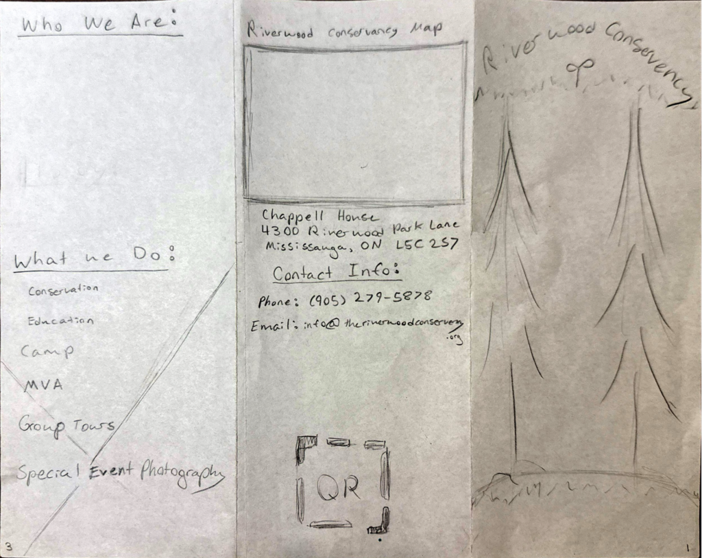
I began by researching the Riverwood Conservancy and determining the information that Mississauga residents, who may not have heard of it before, might want to know. Then, I did some rough sketches to work out the content of each panel and the best placement of information and images.
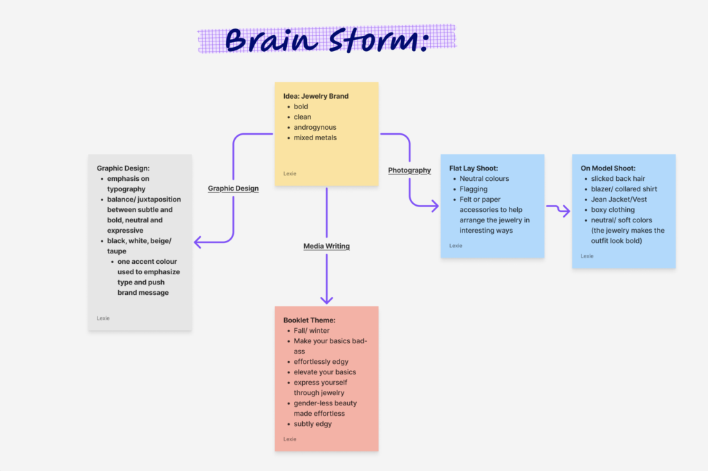
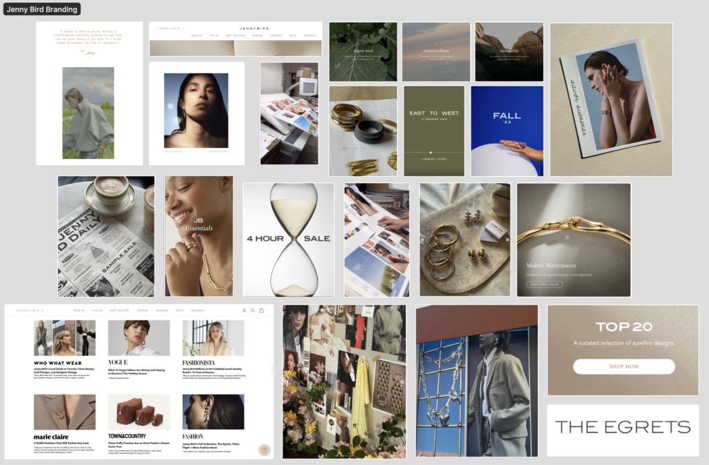
FASHION BOOKLET
Conceptual Magazine for JENNY BIRD
This fashion booklet for Jenny Bird showcases my ability to bring to life a multi-disciplinary creative project from concept to completion. I began by establishing the visual direction and overall structure, then I designed the full layout to create a clean, modern presentation that aligns with the brand’s identity. I photographed all imagery—product shots, styled features and detail-oriented visuals, creating a unified aesthetic across every page. I also wrote the copy throughout, elevating the storytelling by ensuring the voice, tone and messaging reflected the brand’s personality. The final booklet demonstrates my strengths in creative direction, design, photography and brand-aligned writing, all integrated into one cohesive piece.
The Process